Good morning everyone!
Today I want to share a few layouts that are gorgeous, dramatic, a little bit whimsical and more on the simple side.
Now simple does not mean it easy - it really is not...
simple means there is usually white space, sophisticated, use of solid colors or minimal/light design on papers and the photo is front and center!
The first one is simply stunning and from
Sindi using the scraps Of Darkness 'Sindi's Summer Day' kit
She decided to pair the pink watercolor from the kit with some gold
glitter. She painted on pink stripes, alternating with gold glitter.
She liked the triangle stickers from the kit, so she decided to mimic those with some patterned paper.
She topped it all off with some black paint splatters. She decided to do my
journaling in a curvy fashion because the layout is arranged in a
linear pattern.
Next up is a wonderfully fabulous layout from Tracey Gregory using the same kit....
Tracey was inspired by our June inspiration board!
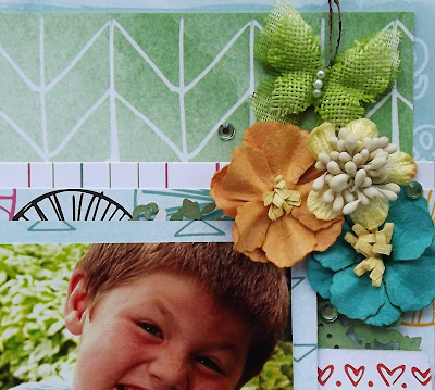
And finally a fun and whimsical layout by me using the same kit!
The adorable kids are our goofy son Tyler and our silly niece Alicia! They were really enjoying being funny together!
I created a little banner and did a floral cluster!
I added a few gems from a previous kit!
In the color add on are the wonderful color lab sparkling pigments! They are very cool!
I wet my brush and dipped it the powder and then painted the wood hearts!
Thanks for stopping by!


No comments:
Post a Comment
Note: Only a member of this blog may post a comment.