Good morning. We've got something awesome to share today.
Stéphanie created a gorgeous double art journal page spread with our Lisa's Sweet September Kit:
She did alot of layered image transfer on these pages, and it turned out just amazing. She's also done a photo tutorial, explaining each step she did in creating these pages. Here's what Stéphanie wrote:
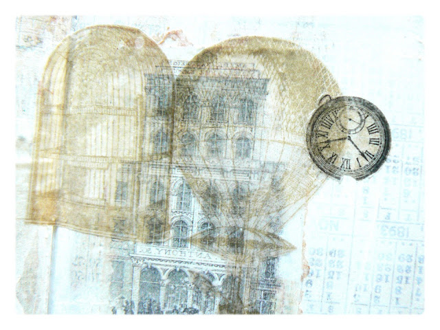
"This double page is an illustration of the technique of "Image Transfer". I love this technique and I already knew it but I was using it before with simple gel medium. Here I found another product that I tried, the special "Image Transfer" from Pébéo. Operation is almost easier and especially the result is quite different. With this product, I have to get in the end my whole image, I can not tear a piece image for a style "draft" "Old torn picture or image." The interest with this product is that when we superimposes the images, we see them all through the transparency. It's pretty fascinating. Here, then, I had fun working on the "COLLAGE", image overlay and printed texts to create a COLLAGE.
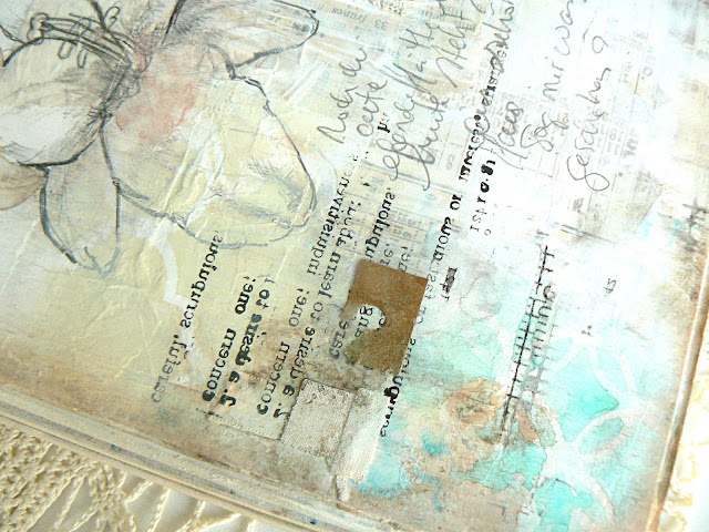
Below are some detail shots, and right after, my tutorial to illustrate this double page:
Below are some detail shots, and right after, my tutorial to illustrate this double page:


PHOTO TUTORIAL:
To begin, I chose a paper from the Blue Fern Studio Autumn Anthology collection, 'Balcony' from the main kit, to cover my double page. I use the printed designs for my background:

Then I glued various paper cuts with other printed writings and some small pieces of masking tape. This allowed me to hide the floral designs that were on the paper, I didn't want them on these pages.

The printed papers are just the base and I try to get a very light background, which approximates a white sheet of paper with some visible detail. So I covered my double page with gesso with a rigid card (completely randomly).

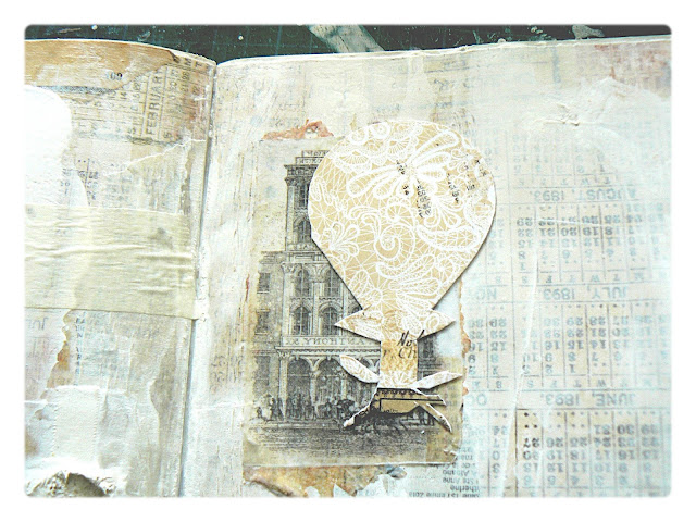
I cut out a design from the 'Cottage' paper (also from the Main Kit) and I'm preparing to transfer its image on my double page.

I apply three layers of 'Image Transfer' product from Pébéo. The product is a clear varnish, it respects the colors; the application of 3 coats of varnish creates an completely ultrathin transparent film; it is on this film that the pattern will appear after removing the paper.

After applying 3 layers of varnish, I apply a new layer , do not dry. I apply the design where I want to see that it appears. I transfer it by pressing, and with the help of a wet sponge I rub on the paper to remove material until the design appears.

It is not essential, but I prefer to apply a layer of gel medium to fix the design on the paper.

I create a collage with various designs using the same technique. I cut out on my papers designs that I selected.

I continue in the same way: I applied three coats of varnish on a design, and a fourth layer which is used to stick the design on the base:

It's quite fascinating to see when the second design is superimposed on the first. We see the first design under the second thanks to the transparency. It is as if we had used two stamps. The interest is obviously to use designs that we spotted in pages, books or any other document, respecting exactly the colors of the original design.

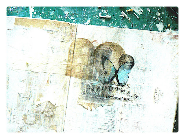
And I continue on the same way:

Here I use a 'Butterfly' picture that I found on Pinterest, this motif was interesting, the color served to bring contrast for my work and I would use it later in other ways. Always with the Pébéo varnishes, I transfer the "Butterfly" picture and then i took a piece of text on the "Cottage"sheet . You should know that with the image transfer technique, the transfer of the 'written' image is backwards! But personally for this kind of work, I have not wanted to be able to read these words that were to appear on my page.

Then I was inspired by a design on the 'Creme de la Creme' sheet from the Graphic 45 Gilded Lily collection (also in the Main Kit): the lily. I isolated two lilies of this page. I deliberately tore the design so that i only see the lilies in part. I make a transfer of a lily on the right page to complete my COLLAGE, and I make a second Image transfer on the left page to start working on this side.

I was really inspired by this design, as it also served as a basis to draw a new lily with a wooden pencil on the left page.
I used then the stencil included in the kit of this month, 'Moroccan Tile & Vine' from Rebecca Baer, with the chalk ink from Ingvild Bolme, also included in the main kit. I use it on the both side.
I used then the stencil included in the kit of this month, 'Moroccan Tile & Vine' from Rebecca Baer, with the chalk ink from Ingvild Bolme, also included in the main kit. I use it on the both side.

I start by adding color sparingly. I use a blue gelato on a Prima clear stamp, the design appears slightly deformed exactly as i want.

Before the paint dries, I slightly blurred some designs with a water brush. Some patterns are 'embedded' in water.

With "text", "numbers" stamps, I apply some impressions here and there. I also use masking tape to bring other designs.
To highlight this double-page, I decided to ink randomly the edges of my very pages, with a DISTRESS ink from Ranger or I vary the colors with brown tones from Lindy's Stamp Gang:
To highlight this double-page, I decided to ink randomly the edges of my very pages, with a DISTRESS ink from Ranger or I vary the colors with brown tones from Lindy's Stamp Gang:

Finally, I use a 3D stencil with Lindy's Stamp Gang sprays.

And again, the finished masterpiece from Stéphanie:


Awesome techniques Stephanie! Thank you for sharing!
ReplyDelete