On an earlier post I shared many feminine projects!
Today I want to show you a few layouts on the masculine side!
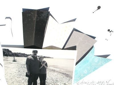
First up is is two fabulous layouts by Sindi using the SOD kit
To make the shapes behind the photo, she cut rectangles from some of the
patterned paper, then cut them in half lengthwise on a diagonal to
make the ends pointed, then cut a "v" shape into the flat ends of two
shapes. For the title, she traced around some chipboard
letters on white cardstock, cut them out and adhered them with
dimensional tape.
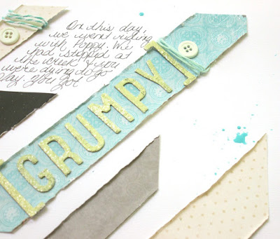
 She used an older photo of her little guy standing around looking grumpy. She cut strips of
patterned paper in rectangles and snipped the ends to look like they
were on a diagonal then roughed up the edges. She added a few buttons and wrapped some twine around some
pieces and also used some leftover chipboard shapes from last month's
kit.
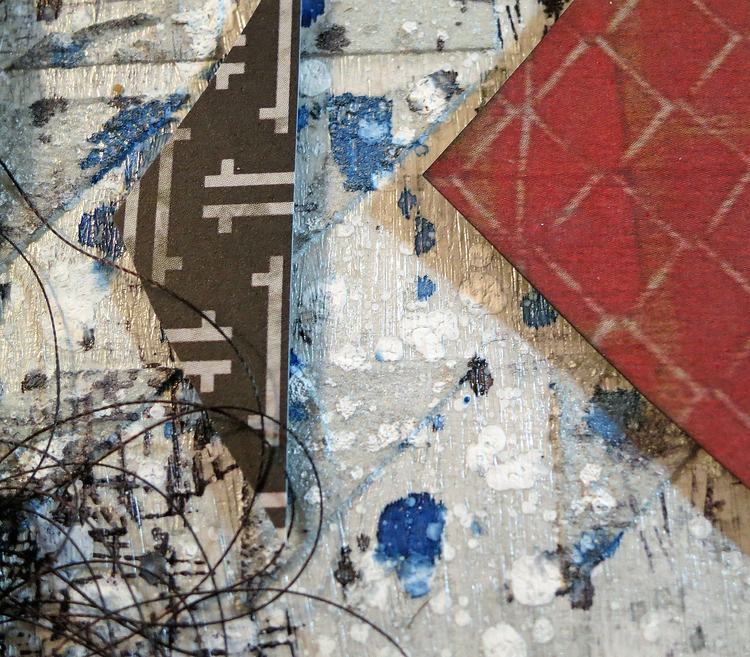
Next is a fabulous layout by Kathy also using July's SOD kit
Starting with a plain white piece of cardstock, she covered it with gloss gel
medium. Next she used modeling paste
and an older stencil with triangle designs, she wanted a geometric feel
to the layout. she outlined some of them with a black pen to make them
stand out. Once everything dried she sprayed the around the area where
the photo, mats, etc., would be located with silver, black and
blue inks and gesso to make the paint splatters. she also stamped like
crazy using a Bo Bunny stamp.
Next up is a real stunning piece from Wilma also using the SOD kit.
For the background, first some stamping here and there. Melinda always puts the embellishments in paper bags when she sends out the kits, so Wilma used it!
She took a piece of it, ripped it and used it on her first layer.
The paper wings are cutouts from the Bo Bunny emporium line, which was part of the kit.
Over it the she placed the Finnabair metal wings from the Elements Add On.
With a brush and Lindys mist from the color add on she added lines here and there under the cluster and around the borders.
She did not want flowers , so she tore a few little leftovers pieces of paper and crunched them .
A touch of texture in place of flowers.
and Finally a layout by me....
The handsome dude in the photo is our oldest son....he really is a wonderful kid.
This shot was taken just before he started high school!
The Gears and stuff are chipboard and metal pieces. Bits and pieces left over from previous kits.
I wanted everything to look cohesive so I misted, painted, gessoed and embossed them all to look like old metal pieces.
Thanks for stopping by!
~Laura


No comments:
Post a Comment
Note: Only a member of this blog may post a comment.